THIS blog post has been a LONG time coming... I have kept putting it off because I wanted to do the invitation – and the couple – justice, and not just rush through it to get it up on the blog quickly. Unfortunately that has left us here, more than 3 months OVERDUE! So here it is, the Harry Potter, Marauder's Map-Inspired wedding invitation for Dina and Travis.
Let me start out by saying how absolutely SMITTEN I was with Dina and Travis from the moment I met them. I already had a soft spot for them before we even met since they had found us through
Nickel City Studios, and I can't help but feel a kindred spirit with couples having the same wedding photographers as we did. As I spoke to them about their wedding plans, Dina laid out one eccentric, crazy, awesome idea after another, with the most amazing "I don't care if anyone gets it, we love it" attitude I've ever seen in a bride. It wasn't a Harry Potter-themed wedding, it was just one of the many things they loved that they wanted to be a part of their big day to make it perfectly "them." {i.e. the "table numbers" were
Bruce Campbell characters and movie posters, and the pastor started off the ceremony with the wedding intro from the
Princess Bride... yeah... #epic}
Every Harry Potter fan who swung through our booth at
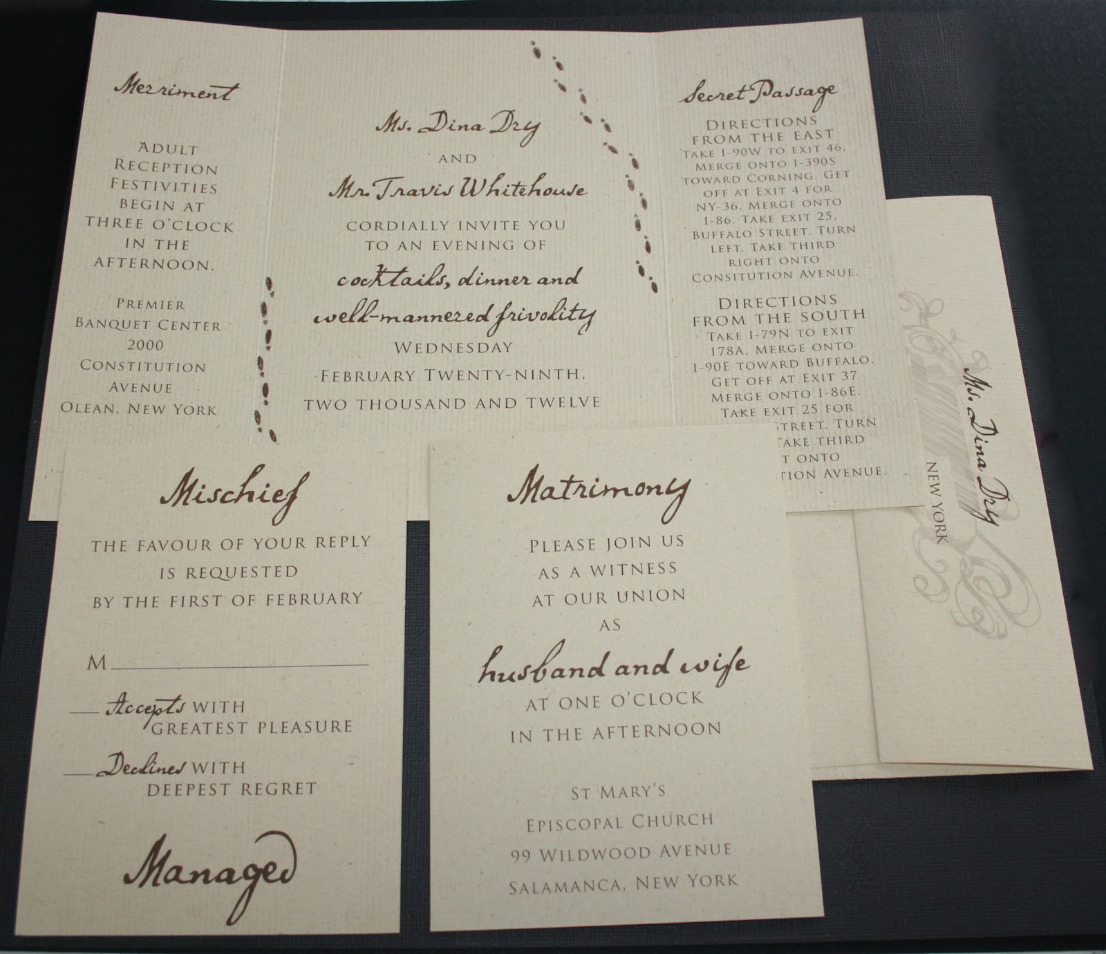
Brides World this past January noticed this unique invitation right away. We designed the front to look like the outside of the Marauder's Map from the Harry Potter movies, but included Dina and Travis' names in the banner, and a drawing of the small church in Salamanca they were married in in place of Hogwarts.
Any time I get an opportunity to do an old-school pen and ink drawing for an invitation, I am a happy camper... so doing two made me VERY happy...
Footprints (we, unfortunately, had no way of making them move} surrounded the reception information, which had little nods to the story without being all magic wands and owls. Another fun twist, the church was too small to invite everyone on their guest list, so the main invitation was for the reception, and a separate card had the information for the ceremony that only went to closest friends and family.
Sealing the whole thing up was a pearlized white wax seal, with a simple image of a house. I originally designed the seal as red, with a monogram, but Dina and Travis said they wanted white wax, with a house... because Travis' last name is Whitehouse. White. House. We all thought it was hilarious, so of course we ran with it!!
So if you want more, more, more of Dina and Travis' awesome leap day wedding (oh yeah, did I mention they got married on a Wednesday? Because February 29th just sounded fun) you can check out their feature on
Off Beat Bride or the rest of their amazing photos on the
Nickel City Blog.
Thank you Dina and Travis for letting me be a part of your incredible day, and for being the epitome of why I love love love what I do, and where I do it.