Monday, July 16, 2012

We Solemnly Swear We Are Up To No Good...

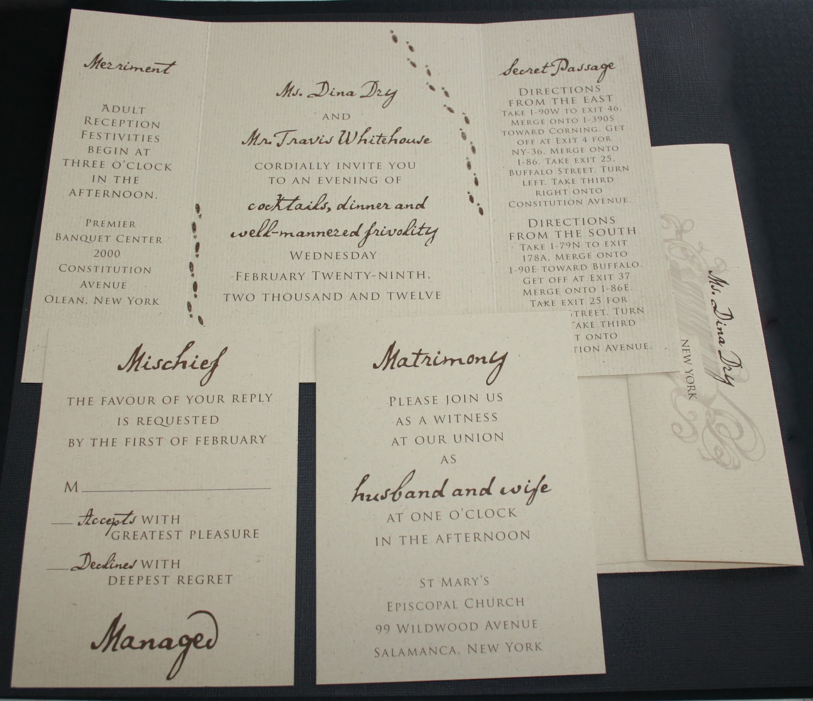
THIS blog post has been a LONG time coming... I have kept putting it off because I wanted to do the invitation – and the couple – justice, and not just rush through it to get it up on the blog quickly. Unfortunately that has left us here, more than 3 months OVERDUE! So here it is, the Harry Potter, Marauder's Map-Inspired wedding invitation for Dina and Travis.

Let me start out by saying how absolutely SMITTEN I was with Dina and Travis from the moment I met them. I already had a soft spot for them before we even met since they had found us through Nickel City Studios, and I can't help but feel a kindred spirit with couples having the same wedding photographers as we did. As I spoke to them about their wedding plans, Dina laid out one eccentric, crazy, awesome idea after another, with the most amazing "I don't care if anyone gets it, we love it" attitude I've ever seen in a bride. It wasn't a Harry Potter-themed wedding, it was just one of the many things they loved that they wanted to be a part of their big day to make it perfectly "them." {i.e. the "table numbers" were Bruce Campbell characters and movie posters, and the pastor started off the ceremony with the wedding intro from the Princess Bride... yeah... #epic}

Every Harry Potter fan who swung through our booth at Brides World this past January noticed this unique invitation right away. We designed the front to look like the outside of the Marauder's Map from the Harry Potter movies, but included Dina and Travis' names in the banner, and a drawing of the small church in Salamanca they were married in in place of Hogwarts.

Any time I get an opportunity to do an old-school pen and ink drawing for an invitation, I am a happy camper... so doing two made me VERY happy...

Footprints (we, unfortunately, had no way of making them move} surrounded the reception information, which had little nods to the story without being all magic wands and owls. Another fun twist, the church was too small to invite everyone on their guest list, so the main invitation was for the reception, and a separate card had the information for the ceremony that only went to closest friends and family.

Sealing the whole thing up was a pearlized white wax seal, with a simple image of a house. I originally designed the seal as red, with a monogram, but Dina and Travis said they wanted white wax, with a house... because Travis' last name is Whitehouse. White. House. We all thought it was hilarious, so of course we ran with it!!

So if you want more, more, more of Dina and Travis' awesome leap day wedding (oh yeah, did I mention  they got married on a Wednesday? Because February 29th just sounded fun) you can check out their feature on Off Beat Bride or the rest of their amazing photos on the Nickel City Blog.

Thank you Dina and Travis for letting me be a part of your incredible day, and for being the epitome of why I love love love what I do, and where I do it. 
Tuesday, June 12, 2012

Casino Party!

Nick and I both come from very large families, and the best part of that is there is almost always a party to plan. Right now, we're planning my sister's wedding, and that means all the parties that go along with it! Including her bridal shower... but we didn't want to do a traditional afternoon shindig. Kacie is a BIG casino fan, so we decided on a Monte Carlo themed Casino Night!


We started with an invitation designed like a playing card; not a new idea, but a perfect fit.


As for the party itself, we set up card tables, and even rented a slot machine from a local company that specializes in casino parties.

As people walked in they picked up mini gift bags with poker chips and tokens for the slot machine.

The lovely ladies of Thelma and Louise Catering made themed appetizers - like clams casino and poker chip crackers!

We decorated spade, heart, diamond, and club shaped cookies, and tied with matching thank you tags.

AND NOW, the best part! Rather than see all of these party elements end up in the trash, we're giving them away to one lucky "fan." To enter the raffle, just make sure you've "liked" us on facebook, then comment on this blog post, or on our facebook page. The winner will get:
- Labeled mini-gift bags
- Thank you tags for favors
- Big stack of cardboard playing card coasters (we got from a bartender friend).
- Cards for appetizers, with menu cards, and/or 10% discount on catering services from Thelma and Louise Catering.
- 10% discount on customized invitations if you order from us.


Congratulations, Kacie and Mike, cannot WAIT for the big day!!! xoxo


Wednesday, April 18, 2012

Our Newest Pet {Project}

Oh my goodness, we've been so busy with the start of wedding season we've had no time to blog, OR to introduce our newest addition...
Here she is, our darling "Kelsey."


(Yes that's a baby monitor on the letterpress table... luckily Sam sleeps right through the clanging of the press; perhaps she finds it soothing, a girl after my own heart...)

Right now she's just our little pet hobby, we're only pressing invitations for close friends and family. We do hope to open a little greeting card Etsy shop someday soon though, so we will keep you posted!


A sneak peek at Andrea's. {You can check out her gorgeous Etsy shop here!}


A sneak peek at Kacie's.

Wednesday, January 18, 2012

Cozy, With A Touch of Rustic

 I have to admit, when I first heard Jeanne's wedding colors were red and turquoise my first reaction was not "WOW that sounds so pretty!!" However, I am a gal who can admit when she's wrong, and as soon as I googled some photos of red and turquoise weddings, well, color me embarrassed! They look AMAZING together, I only wish I could have seen the photos from the rest of her wedding. {hint, hint, Jeanne, if you're reading this, hint...}


Their style was going to be simple, with a rustic touch. November in Buffalo is definitely not toasty and warm, so they had an almost holiday-y feeling going, with jute twine, cranberries in the centerpieces, the tone she described was almost cozy feeling!


I think my favorite part of this suite is the red response envelopes, with the white writing. Definitely not the easiest thing in the world to pull off, but I think it works SO well with this design.


Thank you Jeanne and Billy for letting us design your totally rad invitations, and for teaching me to never doubt a bride's color choice again!! I'm sure your day was absolutely gorgeous. 

Thursday, January 12, 2012

Brides World Buffalo 2012 Recap!

Another Brides World Buffalo is behind us, and yes, it has taken me several days to write this because we have been regrouping. It is only one day (okay, one weekend if you count set-up) but oooo-wee is it a busy one! We love the whirlwind of it though! So here are some pictures, if you missed it in person:

My Mom and Kacie came to help (sorry Mom, I had to post this picture, hahaha!)


This was our sample invitation suite, we will be having a closeup, more detailed post on this later!

I was inspired by The Night Circus by Erin Morgenstern for this suite, if you have not read it I definitely recommend, the imagery in it is so lovely!


This was our table in the table gallery:

It was designed to go with the invitation suite we had in the booth.

The full design featured centerpiece, candles, napkin rings, chair covers, table number, and menu/table cards.

The menu/table cards were personalized for each person. (More on this later!!)


There are my [very amateur] photos from the show, we will be posting more soon on the actual design featured, plus our drawing for the raffle we had at our booth for 75 custom thank you cards!


Friday, January 6, 2012

Brides World Buffalo 2012


Tomorrow is the big set-up day for Brides World 2012. Here's our [now annual] sneak peak, hope to see all you "nearly-weds" there!! 

Saturday, December 31, 2011

End of Year Wrap Up

Well here we are at December 31, and what an AWESOME year it has been!! I still have 2 more weddings from 2011 to post, but they will have to wait for January. For now, let's do a little looking back at some of the smaller projects we did this year!!

This was Josh and Amanda's thank you card/Christmas card! They were married so close to Christmas they wanted to combine the two, which is such an adorable idea!


Some art deco stationery done for Mr. Rich Mattingly over at Nickel City Studios for his "Oma." 

More personal stationery, this time a gift for a lovely lady who is actually getting married ON New Year's Eve! This one was fancy schmancy letterpress though, the metallic purple ink made us swooooon!

We love when people give stationery as a gift, I hate to think that hand-writing notes is a thing of the past. Even as much as I love my menagerie of technology, nothings warms the cockles of my heart as much as receiving a hand written card or letter!


We also had the opportunity to design some awesome biz id for a pie company! (This is the only sample photo I got #sadface)


Now that your mouth is watering, check out this menu card for the amazingly talented ladies at Thelma and Louise Catering (again, no samples, wah waaaah):


Some stuff we did in-house this year, the birth announcement for our little fire cracker:

And her baptism invitation (we may have gone slightly overboard, but we couldn't help ourselves!)


An library-inspired e-vite for a book club friend's baby shower:


A business card for my Uncle-In-Law, if you are in the Lockport area, you can find him playing his GUI-tar at Pour Boys most Wednesday nights!

Holy hell, I almost forgot one of Buffalo's greatest triumphs of the year. It's barely worth mentioning from a design point of view, seeing as the guidelines for the branding on these events are the strictest I've ever seen, however it represents one of the most AMAZING acts of determination I've ever witnessed. The fact TEDxBuffalo even happened is a testament to the solid people of this city, and I feel honored to have been a [small] part of it, and the incredible group of people that actually pulled it off. You can check out a full recap and more about it here.


Well, that's it for us this year, we are still in hurry mode for BridesWorld 2012, coming up January 8th - if you haven't gotten your tickets yet there is still time! We hope to see you in the Convention Center! Until then, have a happy and healthy new year, from all of us here at Rust Belt Love! xo


Monday, December 12, 2011

An Art Deco Affair

This week we have another FULL wedding design post for you, and what's more, some GORGEOUS pro photos for your viewing pleasure.

Let's start with the invitation. When we first met with Katie and her mom, and her sister, and her mother in law, and her fiancé (yes, we LOVE when everyone wants to be involved, it is actually super fun for us, haha) Katie just wanted simple, clean, with shades of green and an art deco feel. Which was perfect since she was having her reception at Asbury Hall, a gorgeous gem of a hall in Downtown Buffalo, an old church repurposed by Annie DiFranco for a multitude of musical purposes. If you've never been, I hope you get the privilege sometime soon, it's a sight to be seen.


Since the interior is so beautiful, and green, we decided to incorporate an illustration of it right into the design of the invite. 


Katie (and her mom) also opted for layering, and an RSVP card with matching envelope. I think the off-white linen paper complimented the design perfectly.


Now on to the real eye candy. Katie and John's photographers were Jenn and Ben from Ayres Photography , and as you can clearly see below, I should stick to the paper and let the pros do the photographing.


The programs were double sided, mounted on a green layered paper that matched the invitation style, replacing the drawing with the bride's and groom's names. 


At Asbury Hall, we did all the centerpieces, as well as several extra bouquets for the guestbook table, the fireplace near the entrance, and the gift table.


Each vase was a mason jar, with ribbon, raffia tie, and tag that had Katie and John's name on it, with the date. Inside the vase were river rocks, and bouquets of white and green hydrangea (our favorite!!).


Also near the entrance were the escort cards that matched the invitation and programs. 


Each table had a green cloth napkin that grounded each centerpiece grouping. Along with the bouquets, we did up table cards that, in addition to the traditional table number, each table also had a different street in Buffalo. And with the green color we were using for everything, we just had to make them look like actual street signs. 


We had SO much fun designing this wedding for you guys, we hope you enjoyed it as much as we did. Here's to you, and an eternity of happiness, thank you for allowing us to help bring to life your vision for your special day. 

**Thank you also to Jenn at Ayres Photography for sending us these truly amazing photos. Check out their whole blog post on Katie and John's wedding day.