Tuesday, March 12, 2013

Purple Lanterns

One of my very favorite sayings about Buffalo is it is a giant living room. More often than not I am fortunate enough to remain in contact with my brides after their wedding, usually through the magic of social media and the interwebs. Rebecca is one such bride.


We loved designing this invitation, most of all not because friends of Rebecca have seen her sample in my display and said, "oh yeah, that's SO her." Which is absolutely our favorite part of what we do, the total customization and embodiment of a bride and groom's style.


Rebecca and Matt were having lanterns and hydrangea as their centerpieces, so they sent me a photo of the lanterns and I drew them for the invitations.


They also wanted to stay as green as possible and went with RSVP postcards, our favorite! And to top it all off they put a funny little twist on their responses. (Our other favorite thing for couples to do!)


Thank you so much, Rebecca and Matt, for letting us be a part of your beautiful day and for sharing such wonderful words about us. Looking forward to seeing you around the "living room" - since everyone knows you are most easily spotted by Matt's beautiful hair, haha!


Tuesday, January 22, 2013

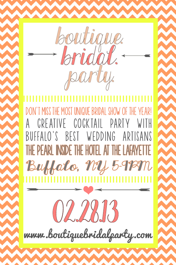
Buffalo. Boutique. Bridal. Party.

We are SO EXCITED to be a part of this bridal show, coming up the 28th of February, at the gorgeous Hotel Lafayette. If you haven't seen us talking about it all over Facebook, here it is:


Check them out for yourself at their website or their Facebook page, and make sure you RSVP to their event on Facebook! Buy your tickets online or at the door, tickets to the event are only $8, include appetizers, raffle items, fashion shows, live performances & more. The first 75 brides will receive a free "Party On, Brides" tote bag and 100% of the ticket sales will be donated to the Compass House to benefit WNY homeless youth. 

And now here is OUR special offer!! Forward us the confirmation email that you've bought your tickets, and we will have a special little treat waiting for you at our booth at the show!!  {rustbeltlove (at) gmail (dot) com} I hope to see you there!!

Thursday, January 3, 2013

Sinatra Style


When I first met with Mark and Mary, they described the feel they wanted their wedding to have with words like "Old vineyard class" and "Sinatra Style." They were possibly our most organized couple of 2012! They knew exactly what they wanted, and we were thrilled to be able to put what they had in their brains onto paper. These were the invitations that we all agreed expressed those words best!

The invitation was decorated with a simple grape and vine line drawing at the top and border. The pocketfold was closed with a hand drawn B monogram.

 We also designed place cards and menus for their reception at Salvatore's Italian Gardens.
They also had the vineyard graphic and wine color paper and fonts.

Carrying the winery theme, Mary made wine charms as favors for all of the guests. She and her guests enjoyed it so much, she opened up an Etsy shop of her own! Check it out!!


 Congratulations, Mark and Mary, and thank you for letting us be a part of your beautiful, Sinatra-esque day.


Tuesday, November 27, 2012

Wedding with a View

Whew, this wedding was probably our biggest of the year! We don't usually take on executing a full wedding design, including flowers, by ourselves but we took exception for this one!

This wedding was lovely, feminine and elegant, in black, ivory and blush. My favorite part of the invitations were the black and ivory lace envelope liners, and a pattern we carried throughout the printed materials.


Natasha and Gene had an outdoor wedding in August, so we made the programs fans, repeating the lace pattern paper. The place cards mirrored the invitations, mounted on a blush pink paper. We also created CD cases as favors, with their custom playlist printed and mounted on the inside.


Here is the outside of the CD favor, on the table at the reception.

Photo by Stephanie Burns Images

The reception was held at Glen Oak Country Club, overlooking the golf course. I think I'll just let the photos speak for themselves on this one.

Photo by Stephanie Burns Images

We are loving these chair covers, they're spandex so they fit to the form of the banquet chair. We think it gave the room a much more streamlined look. We also went with floor length black tablecloths for a more elegant look, topped with an ivory satin runner. Table linens and chair covers are courtesy of Thelma and Louise catering, give them a ring if you'd like to rent these for your event!


 The sweetheart table was an ivory lace overlay on top of a floor length black tablecloth, topped with two small black vases holding ivory and blush flowers. In the center of the table was a box with their monogram that doubled as a vase for the bride's bouquet.

Photo by Stephanie Burns Images

In the entry way, like the sweetheart table, we used an ivory lace overlay for the entry table that held the placecards.

Photo by Stephanie Burns Images


We alternated three different ivory and blush centerpieces. One large globe of flowers on an elegant, slender black stand. Another was a grouping of 5 different small black vases with ivory and blush flowers, accented with wispy black ostrich feathers. The last was a small black urn, filled with blush garden roses.


Photo by Stephanie Burns Images

Photo by Stephanie Burns Images


Photo by Stephanie Burns Images

Here is a shot of the lovely ladies with their bouquets, which we also did. They just wanted very simple, small bunches of roses. The bridesmaids carried ivory garden roses, wrapped with black satin ribbon. The bridal bouquet was blush garden roses, and delicate ivory and pink flowers, that {I think} are called tea roses, at the center. We surrounded the flowers with more wispy black ostrich feathers and wrapped them all in black ribbon.

Photo by Stephanie Burns Images

The program on the bouquets.

Photo by Stephanie Burns Images
The program fans hung from the chairs at the outdoor ceremony, which of course we did not get a photo of.

Photo by Stephanie Burns Images
Here is a shot of the ceremony once everyone was sitting, and I think if you check out the front row you can see a program or two left on the chairs.

Photo by Stephanie Burns Images

Phew I think that does it for Natasha and Gene's wedding. Thank you for having me design your beautiful day, I hope you thought it was as lovely as we did.

Monday, September 17, 2012

Sparkle Sparkle!

So, my sister Kacie is seriously hilarious. She loves things that sparkle, shine, blink; she's our little magpie. So of course her wedding had to be covered in diamonds... literally.

Kacie's invitations were silver letterpressed onto super soft suede-like black paper. We started out with an idea of doing paper lanterns, but in the end opted for a more graphic theme.


The black card was mounted on a silver layer, then onto a red panel pocket. In the back pocket was the response envelope (letterpressed by the groom himself!!), the response card (letterpressed by the bride!) and the reception card. I loved how Mike and Kacie wanted to get in on the action!! Each pocket was finished off with a small jewel (a detail that would be carried throughout all the printed pieces!)


The programs were simple double sided black and white prints, mounted on red layers, with that small jewel embellishment again!


 For the reception, we did table number menu combinations, a piece we've done a few times this year, and I simply love it! The reception was at Banchetti's by Rizzo's, and their Family Style dinner was absolutely WONDERFUL! And so much fun to share, it really gave dinner such a relaxed, family feeling, while still being delicious and elegant!


More bling:


We also did the centerpieces, the candy bar, and all the flowers! Luckily, Ben, at Banchetti's, was so awesome to work with, he basically gave us the three days before the wedding to set up, all at our own pace. Which definitely helps when the designer is IN the wedding! PHEW!

Photo by Stephie Lei Photography

The bride's bouquet:


Photo by Stephie Lei Photography

Please enjoy these awesome iPhone photos: (I know, I am THE WORST)


Thank you so much, Kacie and Mike, for letting me be a part of your special day. You both looked amazing, and I don't think I've ever seen such a happy couple in my life!! Wishing you a lifetime of happiness and health, we love you so much. :)


Monday, July 30, 2012

Balboa Style


 I always say how lucky we are to have so many super creative friends around us. Andrea and her fiancĂ© Michael, who you have met before, have been our letterpress-hobby guinea pigs going way back to their Save the Dates. So when they decided they also wanted us to letterpress their invitations, we were all over it.
And by "over" I mean in over our heads... way over. Andrea is seriously like, the nicest person you will ever meet, so of course she had roughly a million friends and family to invite to their big day. Okay... not a million, but a whole lot, and after giving it the old college try, we had to concede that our little table top sweetheart Kelsey was just not up to the challenge.
Enter our heroes Jodi and Shelly at French Press. They totally saved the day by finishing up these deliciously pressed invitations you see below.


Andrea's wedding was at the Prado, in Balboa Park, in San Diego. Surrounded by gorgeous Spanish and Moorish design, Andrea and I went back and forth over many different designs to come up with an one that was inspired by both old wrought iron scrollwork and the patterns on Spanish tile. 


This was a Wedding Weekend Extravaganza, if there has ever been one! Andrea thought of everything, including arranging childcare for guests traveling with children. We did press the Childcare, Brunch, and Accommodations cards in-house! (Yay us!) 
We chose Crane's 220# super duper thick cotton paper, that was 100% tree-free!


 We also pressed the envelopes and envelope liners. The bride and groom's name was printed on the liner in charcoal ink for you to see when you opened the envelope. The outer and RSVP envelopes both had 2 color printing, with the design from the invitation in green around their names and address in charcoal, on the flap of the envelope for the return address, and the front of the RSVP envelope.


 Thank you Andrea and Michael for being our letterpress guinea pigs, it was an adventure, and we wish you all the best in the world as you start out on your new life together. I only wish we'd been able to be there to see it!! Congratulations, I know you will spend the rest of your lives making each other so happy. :)