Saturday, December 31, 2011

End of Year Wrap Up

Well here we are at December 31, and what an AWESOME year it has been!! I still have 2 more weddings from 2011 to post, but they will have to wait for January. For now, let's do a little looking back at some of the smaller projects we did this year!!

This was Josh and Amanda's thank you card/Christmas card! They were married so close to Christmas they wanted to combine the two, which is such an adorable idea!


Some art deco stationery done for Mr. Rich Mattingly over at Nickel City Studios for his "Oma." 

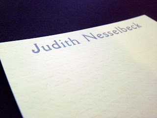
More personal stationery, this time a gift for a lovely lady who is actually getting married ON New Year's Eve! This one was fancy schmancy letterpress though, the metallic purple ink made us swooooon!

We love when people give stationery as a gift, I hate to think that hand-writing notes is a thing of the past. Even as much as I love my menagerie of technology, nothings warms the cockles of my heart as much as receiving a hand written card or letter!


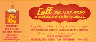
We also had the opportunity to design some awesome biz id for a pie company! (This is the only sample photo I got #sadface)


Now that your mouth is watering, check out this menu card for the amazingly talented ladies at Thelma and Louise Catering (again, no samples, wah waaaah):


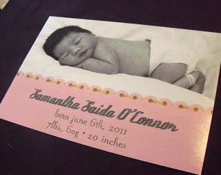
Some stuff we did in-house this year, the birth announcement for our little fire cracker:

And her baptism invitation (we may have gone slightly overboard, but we couldn't help ourselves!)


An library-inspired e-vite for a book club friend's baby shower:


A business card for my Uncle-In-Law, if you are in the Lockport area, you can find him playing his GUI-tar at Pour Boys most Wednesday nights!

Holy hell, I almost forgot one of Buffalo's greatest triumphs of the year. It's barely worth mentioning from a design point of view, seeing as the guidelines for the branding on these events are the strictest I've ever seen, however it represents one of the most AMAZING acts of determination I've ever witnessed. The fact TEDxBuffalo even happened is a testament to the solid people of this city, and I feel honored to have been a [small] part of it, and the incredible group of people that actually pulled it off. You can check out a full recap and more about it here.


Well, that's it for us this year, we are still in hurry mode for BridesWorld 2012, coming up January 8th - if you haven't gotten your tickets yet there is still time! We hope to see you in the Convention Center! Until then, have a happy and healthy new year, from all of us here at Rust Belt Love! xo


Monday, December 12, 2011

An Art Deco Affair

This week we have another FULL wedding design post for you, and what's more, some GORGEOUS pro photos for your viewing pleasure.

Let's start with the invitation. When we first met with Katie and her mom, and her sister, and her mother in law, and her fiancé (yes, we LOVE when everyone wants to be involved, it is actually super fun for us, haha) Katie just wanted simple, clean, with shades of green and an art deco feel. Which was perfect since she was having her reception at Asbury Hall, a gorgeous gem of a hall in Downtown Buffalo, an old church repurposed by Annie DiFranco for a multitude of musical purposes. If you've never been, I hope you get the privilege sometime soon, it's a sight to be seen.


Since the interior is so beautiful, and green, we decided to incorporate an illustration of it right into the design of the invite. 


Katie (and her mom) also opted for layering, and an RSVP card with matching envelope. I think the off-white linen paper complimented the design perfectly.


Now on to the real eye candy. Katie and John's photographers were Jenn and Ben from Ayres Photography , and as you can clearly see below, I should stick to the paper and let the pros do the photographing.


The programs were double sided, mounted on a green layered paper that matched the invitation style, replacing the drawing with the bride's and groom's names. 


At Asbury Hall, we did all the centerpieces, as well as several extra bouquets for the guestbook table, the fireplace near the entrance, and the gift table.


Each vase was a mason jar, with ribbon, raffia tie, and tag that had Katie and John's name on it, with the date. Inside the vase were river rocks, and bouquets of white and green hydrangea (our favorite!!).


Also near the entrance were the escort cards that matched the invitation and programs. 


Each table had a green cloth napkin that grounded each centerpiece grouping. Along with the bouquets, we did up table cards that, in addition to the traditional table number, each table also had a different street in Buffalo. And with the green color we were using for everything, we just had to make them look like actual street signs. 


We had SO much fun designing this wedding for you guys, we hope you enjoyed it as much as we did. Here's to you, and an eternity of happiness, thank you for allowing us to help bring to life your vision for your special day. 

**Thank you also to Jenn at Ayres Photography for sending us these truly amazing photos. Check out their whole blog post on Katie and John's wedding day.

Friday, November 18, 2011

Raspberry and Navy Deliciousness!

So since today one of our weddings is totally famous, I thought it'd be a great day to blog about Tricia and Jack's awesome navy and raspberry invitations and reception details. 


Tricia is a very old and dear friend of ours, and anyone who has ever met Tricia knows what an amazing person she is. She is truly always smiling, and possibly the most positive person I know. Her joy is totally infectious, it's impossible not to be happy when around her. I wanted her invitations to convey that same joy, fun, and classy vibe.


Tricia wanted something with a vintage feel without screaming a VINTAGE clichĂ©. So we hand drew the border and incorporated some fun fonts on a heavily textured off-white paper. 


When Tricia and I were initially crafting the design together I threw out the idea of just leaving the names as "Tricia & Jack" and forgoing the traditional middle and last names... My thinking was, if you didn't know who Tricia and Jack were, you probably shouldn't be invited in the first place. (How many Tricia and Jacks do YOU know??) It was a risk, especially with Tricia's pretty traditional family, but we both loved the idea so much, we decided to go for it, and boy did it pay off! Everyone loved it!


We carried the theme throughout the menu/table number cards and place cards for the reception. In true rust belt love form, I have horrible iPhone and Instagram photos of these. {don't worry, I'm rolling my eyes too.}


For GOOD photos of these, and the rest of the amazing reception and wedding check out the pros at Nickel City Studios blog. Truly the best of the best. Tricia and Jack, you guys are so rad, we love you both so much and wish you an eternity of happiness together. Thank you for letting us be a part of this magical day. 


Tuesday, October 11, 2011

TEDxBuffalo


An amazing event!! Blogging live from TEDxBuffalo at Canisius College - or follow my personal account on twitter for updates, or watch, streaming live on ustream: http://t.co/RpFCLapb. Technology, entertainment and design; ideas worth sharing. It's amazing, I'm so impressed with my friends and friendly acquaintances that pulled off this event in a mere 5 months. Truly amazing.

Wednesday, October 5, 2011

Orange and Green Summer Wedding

Today's post is about Ashley's green and orange wedding invitations. Ashley is our favorite kind of bride, the "I don't know what I want, but I'll know it when I see it" kind. The kind that is open to seeing what we come up with. Fun!!


Ashley and Bill long discussed the different styles we sent them, and they compromised on the design you see, incorporating Ashley's love of vines and floral, and Bill's desire for something uncomplicated and graphic. 


I really love the paper they chose. It is such a unique texture, I think it really picked up their simple design well! 


Thanks so much for being awesome to work with guys, I know your day was amazing and gorgeous, and we wish you a lifetime of happiness together. 

Monday, September 26, 2011

Vintage Tea Shower

I MUST share with you all the beautiful shower I went to a week ago! For my beautiful friend Tricia, (whose invitations we will be featuring soon!) thrown by her sister Heidi. This is a gorgeous example of what you can do with a little time and a lot of love.


Each table setting had a box of tea wrapped in ribbon and personalized with Tricia and Jack's initials. The perfect favor - simple, personalized, and useful. 


Place cards coordinated with the invitations and theme of the event.


AWESOME idea - instead of baskets as door prizes, Heidi did auctions for gift cards to area restaurants. And they were from all over, north towns, south towns, downtown; since the guests were all from different areas. 


Each can was a different size, designed with a different font and teapot or tea cup illustration.


She even iced "T" cookies for the tables.


While this was an extraordinary party, she didn't do anything overly difficult or expensive. Heidi is not a designer, but with a little time, taste, and Googling, she threw a party that this designer was VERY impressed with! So steal borrow these ideas, or just use them as inspiration for your next event!

Also, the food was awesome. ;)


Monday, September 12, 2011

Simply Sweet Style

This week's invite was for the darling Miss Karen (now a Mrs.). Karen did not want anything floral, or anything decorative, she wanted all of her styling to be through the text, and we were more than happy to oblige!

Karen wanted to feature her traditional but fun style in navy on cream colored paper. By featuring different fonts and sizes in the text, the words become the design, rather than any graphics or illustrations. It really shows how you can keep things simple but still make a dramatic impact.


She also did a response postcard, which I love! It was the perfect complement to this simple, sweet invitation.  I really just love Karen's style.


So a short and sweet blog post today; if you live here in Buffalo, get out and enjoy this beautiful sunny weather before its back to the darker days of winter!


Tuesday, September 6, 2011

Fabulous Photog

This blog post is dedicated to the most patient, understanding lady I've ever had the pleasure of working with. You know how in your every day job, you now and then come across that one thing that NOTHING goes right with? Everything that can go wrong, does? That was how it was with Stephanie's thank you cards and contract holders. But we muscled through and got them to Stephanie for her fab new biz Stephie Lei Photography.


Stephanie loves butterflies, and wanted to incorporate them with nature in her logo and business identity. Each piece was printed in a cobalt ink on super heavy duty pearlized white linen.


It may be my favoritest paper ever...


The contract folders were finished off with a little tab closure, and a corner stamp embellishment. 


It may have been a long road, but I am thrilled with the way these turned out, and I must say I cannot thank her enough for how she handled everything with such grace and understanding. SO, if you are looking for a photographer for your wedding or event, please check out her Facebook page and give Steph a call. She is not only talented, but she is also the sweetest ever.