Showing posts with label things i heart. Show all posts

Monday, September 29, 2014

Message in a Bottle, Intimate Wedding at City Hall

Up next: Samantha and Mark!! In case you're not completely throwing up from hearing me say it over and over, I love the folks that call WNY their home. And I am thankful we live in an age where you can "meet" and get to know strangers in the crazy living room of Twitter in a way that was never possible before. That was how Samantha and I first met, probably volleying clever/stupid/snarky tweets back and forth, but when she asked me to do her invitations for her, I could not have been more thrilled. I had been wanting to do a boxed invitation for some time, and her intimate, extremely small, extremely personalized wedding lent itself perfectly. How to get over the shipping cost dilemma? She hand delivered each one! A manageable feat when you only have 25 invitations. Lets look, shall we?


 We wanted to tie a sort of "audience participation" element to the invites, so each package was tied neatly with a jute metallic twine, with a small, empty glass bottle on the outside. 

Once opened, there was a small slip of paper that requested that guests write on the back a message, a bit of advice, or a wish for the couple. They were then asked to roll up the piece of paper and slide it into the bottle, and keep it to bring with them to the wedding. Once at the reception, they hung it on the branches of a tree, which served as a lovely, very personal guest book.

Inside was also a feather, and a twig, tied together with the same metallic twine. The feather was a nod to Samantha's native heritage (the eagle feather is a symbol of her tribe) and the twig represented a story of her parents, who had both passed some years ago. It was a way for them to be a part of the wedding in a very real and emotional way. 


The invitation itself featured a drawing of City Hall, outlined in a metallic copper that matched the copper in the twine. Their information was short, sweet, and to the point.


Thank you, Sam and Mark, for asking me to create such a personal, emotional invitation for your wedding. I look forward to seeing your happy faces around town! 

Wednesday, April 16, 2014

Table Names with a Super Twist

Okay, so normally I try to blog weddings in the order they happened, but for selfish and boring reasons not worth explaining, we're gonna jump in the TARDIS and skip ahead to October for JUST a tick. {Sorry, this post has me totally nerding out...}

Cassie and Roy came to me with my favoritest kind of problem: we have this amazing idea but we're not sure how to pull it off and still make it feel "wedding-y." They are both huge comic book fans, and make sure you get that right, NOT comic book MOVIE fans... since most of my knowledge is based on bad Hollywood interpretations of the comic books, there was quite a bit of schooling to be had on my part. 
Cassie and Roy wanted their table names to be super heroes, without feeling like a kid's birthday party. So their idea? Use the heroes' alias last names, coupled with a graphic/picture/illustration of something that would HINT at their superhero identity. And... okay, enough talking, just look at these amazing photos by Dawn M. Gibson Photography:
Photo by Dawn M. Gibson Photography
Each superhero alias got a hand drawn illustration to hint at who they were, all supplied by Cassie and Roy {this is where the schooling came in.} The name and drawing were then used on the table cards, for each table, and on each place card with the guests' names.

Photo by Dawn M. Gibson Photography

Photo by Dawn M. Gibson Photography

Photo by Dawn M. Gibson Photography

Photo by Dawn M. Gibson Photography

Photo by Dawn M. Gibson Photography

Photo by Dawn M. Gibson Photography

Photo by Dawn M. Gibson Photography

Um, so not only was it awesome, but it also turned into a guessing game for the guests. So cool. I love these so much, Cassie and Roy, thank you again for letting me create something so unique to you and your day. From what I saw of the rest of the photos it was a perfect, happy, gorgeous day for two amazing people. 

Wednesday, February 12, 2014

Design, Coordination, and Mandatory Dancing

OKAY, let's keep this blog train a-rolling! (Alright, to be fair 2 posts in one month wouldn't really be considered "rolling" but let's go with it, shall we?)

Next up we have Amy and Steve. Sometimes weddings make me sad, because they mean the end of a really long, fun road I get to go along with - often - a new friend! We started with Amy all the way back in 2012 with her Save the Dates, and when our first meeting took almost two hours (they usually last about 45min to an hour) I knew we were kindred spirits. Ridiculous, hilarious, kindred spirits.


The paper they chose, and used throughout the whole wedding design, was this beautiful bright white, column textured paper. It was such a nice compliment to the classic black and white designs.


We were lucky enough to be asked to do Amy's total wedding design, from the invitations, to the centerpieces, the flowers, even the linens. But first, the invitations! Amy and Steve decided on a black, white and silver color palate, with touches of deep kelly green. Colors that coordinated beautifully with their chosen venue, Asbury Hall.

We are by no means a "letterpress studio" but my little Kelsey tabletop does give me the opportunity to offer touches of letterpress to our digital designs. Enter this gorgeous silver monogram. Pressed into the already textured column paper, against the black and deep green, it adds a spectacular little pop of sophistication.


There was a lot of info to convey with these invites, so we opted for a black pocketfold. We weren't quite sure initially how we were going to display all those cards in a horizontal pocket, until one morning in the shower the idea struck me to have each card tiered and at an angle! {Doesn't everyone do all their best thinking in the shower?}


We had an additional silver letterpress element on the inside! We pressed Amy and Steve's names onto each of the invitation cards, which were then mounted on a green layer, and then a silver one. 


Here you can see each of the cards, along with a place card, and the program. You can see we letterpressed their monogram again on the programs, hooray!!
I think my favorite part of the cards is where it says "Mandatory Dancing."  

SO, we didn't necessarily attend Amy and Steve's wedding to coordinate as much as we were invited to attend as guests... I mean what greater feeling in the world is there to get invited to a wedding you've helped design? There is none, FYI. We did do a bit of "making sure everything ran smoothly," but we also did our share of partying and "mandatory dancing."

SIDENOTE on the "mandatory dancing": Amy and her sister were long time dancers, and as adults teachers at a dance school. Seeing an entire bridal party and half the guest list do the Thriller dance from beginning to end = perfection.

Photo by Nickel City Studios

As for the rest of the details, I told you already Amy is hilarious. She's also really smart, and loves books, so obviously for her centerpieces she had to get roses made from the pages of the Princess Bride. {What? Yes.} 
All the guest and entry tables had these hand made paper flowers {I cannot for the life of me find the link to the Etsy seller who made them!!} 

Photo by Nickel City Studios

So remember last time when I said sitting at the vendor table is pretty much the funnest part of my job? Especially when its with awesome photographers? Rich and Alyssa from Nickel City Studios  are definitely one of our favs because they are so much fun and seriously, they always make what we do look so cool... Thank you to them for these gorgeous reception photos. Asbury Hall is dark, and not very friendly to regular {read: iPhone} cameras.

Photo by Nickel City Studios
We did half of the centerpieces high, with these lovely tall vases, wrapped in lace and satin. The other half were lower, with urns filled with white sand and taper candles. Here is a terrible photo of it from my iPhone (I'm sorry, my photos will be better next year, I promise!):


Also, as you can sort of see in the above photo, but better in the photo below, we had silver free-standing numbers for the table numbers. They really popped against the black linens and white candles... Speaking of, thank you to the lovely ladies of Thelma & Louise Catering for the lovely linens, and for not killing us for returning them covered in white candle wax. :)

Photo by Nickel City Studios

More detail shots:

Photo by Nickel City Studios

Photo by Nickel City Studios

Photo by Nickel City Studios

Photo by Nickel City Studios

Photo by Nickel City Studios


Oh, we also did these flowers:
Photo by Nickel City Studios

Since Amy and Steve opted for paper flowers at the reception, we did simple baby's breath bouquets for the girls, a white rose bouquet for the bride, and baby's breath boutonnieres for the gents. 


Amy and Steve, we have loved getting to know you, and your families, we are beyond honored and thrilled to have been invited to be such a huge part of your big day. Thank you for being beautiful people and I'm sure you will spend the rest of your lives making each other happy. You absolutely deserve it.


Tuesday, January 22, 2013

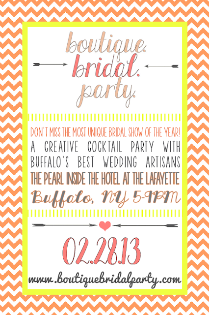
Buffalo. Boutique. Bridal. Party.

We are SO EXCITED to be a part of this bridal show, coming up the 28th of February, at the gorgeous Hotel Lafayette. If you haven't seen us talking about it all over Facebook, here it is:


Check them out for yourself at their website or their Facebook page, and make sure you RSVP to their event on Facebook! Buy your tickets online or at the door, tickets to the event are only $8, include appetizers, raffle items, fashion shows, live performances & more. The first 75 brides will receive a free "Party On, Brides" tote bag and 100% of the ticket sales will be donated to the Compass House to benefit WNY homeless youth. 

And now here is OUR special offer!! Forward us the confirmation email that you've bought your tickets, and we will have a special little treat waiting for you at our booth at the show!!  {rustbeltlove (at) gmail (dot) com} I hope to see you there!!

Monday, September 17, 2012

Sparkle Sparkle!

So, my sister Kacie is seriously hilarious. She loves things that sparkle, shine, blink; she's our little magpie. So of course her wedding had to be covered in diamonds... literally.

Kacie's invitations were silver letterpressed onto super soft suede-like black paper. We started out with an idea of doing paper lanterns, but in the end opted for a more graphic theme.


The black card was mounted on a silver layer, then onto a red panel pocket. In the back pocket was the response envelope (letterpressed by the groom himself!!), the response card (letterpressed by the bride!) and the reception card. I loved how Mike and Kacie wanted to get in on the action!! Each pocket was finished off with a small jewel (a detail that would be carried throughout all the printed pieces!)


The programs were simple double sided black and white prints, mounted on red layers, with that small jewel embellishment again!


 For the reception, we did table number menu combinations, a piece we've done a few times this year, and I simply love it! The reception was at Banchetti's by Rizzo's, and their Family Style dinner was absolutely WONDERFUL! And so much fun to share, it really gave dinner such a relaxed, family feeling, while still being delicious and elegant!


More bling:


We also did the centerpieces, the candy bar, and all the flowers! Luckily, Ben, at Banchetti's, was so awesome to work with, he basically gave us the three days before the wedding to set up, all at our own pace. Which definitely helps when the designer is IN the wedding! PHEW!

Photo by Stephie Lei Photography

The bride's bouquet:


Photo by Stephie Lei Photography

Please enjoy these awesome iPhone photos: (I know, I am THE WORST)


Thank you so much, Kacie and Mike, for letting me be a part of your special day. You both looked amazing, and I don't think I've ever seen such a happy couple in my life!! Wishing you a lifetime of happiness and health, we love you so much. :)


Monday, July 16, 2012

We Solemnly Swear We Are Up To No Good...

THIS blog post has been a LONG time coming... I have kept putting it off because I wanted to do the invitation – and the couple – justice, and not just rush through it to get it up on the blog quickly. Unfortunately that has left us here, more than 3 months OVERDUE! So here it is, the Harry Potter, Marauder's Map-Inspired wedding invitation for Dina and Travis.

Let me start out by saying how absolutely SMITTEN I was with Dina and Travis from the moment I met them. I already had a soft spot for them before we even met since they had found us through Nickel City Studios, and I can't help but feel a kindred spirit with couples having the same wedding photographers as we did. As I spoke to them about their wedding plans, Dina laid out one eccentric, crazy, awesome idea after another, with the most amazing "I don't care if anyone gets it, we love it" attitude I've ever seen in a bride. It wasn't a Harry Potter-themed wedding, it was just one of the many things they loved that they wanted to be a part of their big day to make it perfectly "them." {i.e. the "table numbers" were Bruce Campbell characters and movie posters, and the pastor started off the ceremony with the wedding intro from the Princess Bride... yeah... #epic}

Every Harry Potter fan who swung through our booth at Brides World this past January noticed this unique invitation right away. We designed the front to look like the outside of the Marauder's Map from the Harry Potter movies, but included Dina and Travis' names in the banner, and a drawing of the small church in Salamanca they were married in in place of Hogwarts.

Any time I get an opportunity to do an old-school pen and ink drawing for an invitation, I am a happy camper... so doing two made me VERY happy...

Footprints (we, unfortunately, had no way of making them move} surrounded the reception information, which had little nods to the story without being all magic wands and owls. Another fun twist, the church was too small to invite everyone on their guest list, so the main invitation was for the reception, and a separate card had the information for the ceremony that only went to closest friends and family.

Sealing the whole thing up was a pearlized white wax seal, with a simple image of a house. I originally designed the seal as red, with a monogram, but Dina and Travis said they wanted white wax, with a house... because Travis' last name is Whitehouse. White. House. We all thought it was hilarious, so of course we ran with it!!

So if you want more, more, more of Dina and Travis' awesome leap day wedding (oh yeah, did I mention  they got married on a Wednesday? Because February 29th just sounded fun) you can check out their feature on Off Beat Bride or the rest of their amazing photos on the Nickel City Blog.

Thank you Dina and Travis for letting me be a part of your incredible day, and for being the epitome of why I love love love what I do, and where I do it. 

Monday, September 26, 2011

Vintage Tea Shower

I MUST share with you all the beautiful shower I went to a week ago! For my beautiful friend Tricia, (whose invitations we will be featuring soon!) thrown by her sister Heidi. This is a gorgeous example of what you can do with a little time and a lot of love.


Each table setting had a box of tea wrapped in ribbon and personalized with Tricia and Jack's initials. The perfect favor - simple, personalized, and useful. 


Place cards coordinated with the invitations and theme of the event.


AWESOME idea - instead of baskets as door prizes, Heidi did auctions for gift cards to area restaurants. And they were from all over, north towns, south towns, downtown; since the guests were all from different areas. 


Each can was a different size, designed with a different font and teapot or tea cup illustration.


She even iced "T" cookies for the tables.


While this was an extraordinary party, she didn't do anything overly difficult or expensive. Heidi is not a designer, but with a little time, taste, and Googling, she threw a party that this designer was VERY impressed with! So steal borrow these ideas, or just use them as inspiration for your next event!

Also, the food was awesome. ;)